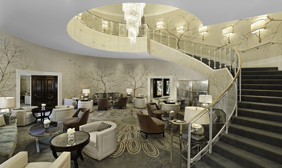
Not only will it set the tone and style expectations for the rest of the hotel, but should also leave a lasting impression upon all visitors and guests. A public area is experienced by many, not just those staying in the hotel, and with the right design, will be remembered forever.
There are many threads within current hotel trends. Boudoir chic to elemental minimalism interior design are acting as a punctuation to a deeper seam of more classically inspired interiors. Within these more classic spaces a tough of humor curiosity compliment the more restrained design language. Location and historical perspective is often a background theme within a design, with small subtle touches helping to reinforce the sense of place. It is indeed a multi stranded design area, with tight functional requirements.
“ …we have noticed a move away from cookie cutting branding concepts, hotels are being designed with the locality in mind, and individual concepts are being created to not only to their brand standards but also to make the scheme special and unique.”
-Rita Bancroft, Design Insider
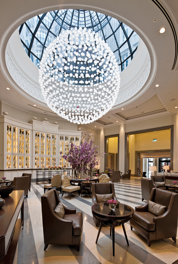
Lobby at the Corinthia Hotel in London
G.A Design are recognized worldwide for their classic chic hotel designs, having won many prestigious awards for their work we at Decca are lucky to have worked with them on both The Corinthia Hotel in London and the Grand Hyatt in Goa.
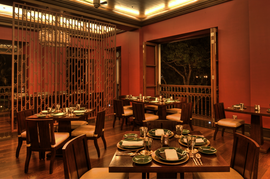
Grand Hyatt in Goa
These touches of individuality are particularly important in public areas. The short time a guest spends here must be memorable, in comparison to the bedrooms where the subtle touches have longer to be observed and appreciated. This is where the aspect of theatre helps build the big impression, high ceilings, imposing art, striking colours.
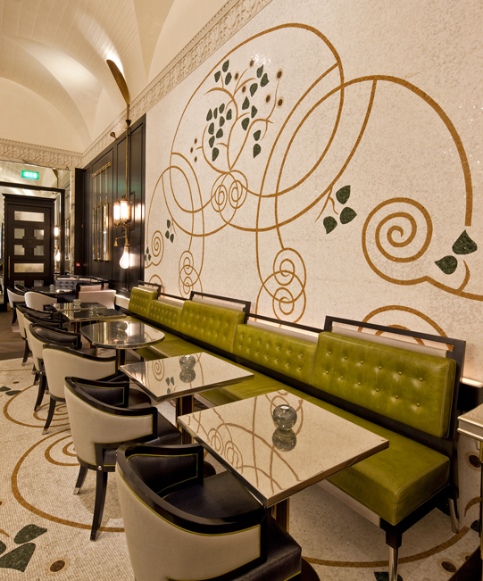
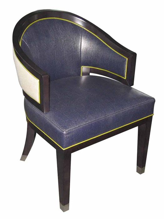
Massimo Restaurant // Detail of the dining chair
This can be seen particularly well in Massimo Restaurant by David Collins Studio – the strong navy, green and gold and oversized light fittings all add to the sense of occasion.
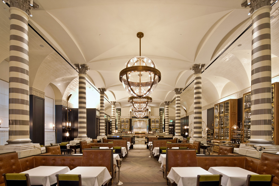
Massimo Restaurant
We worked with David Collins Studio on notable pieces in the Bassoon Bar and the Massimo Restaurant. It has a unique artistic flare that gives guests a feeling of indulgence, but by using small details a strong story is built to convey a particular ambiance.
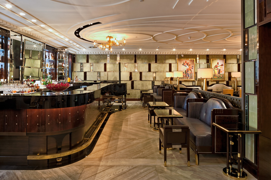
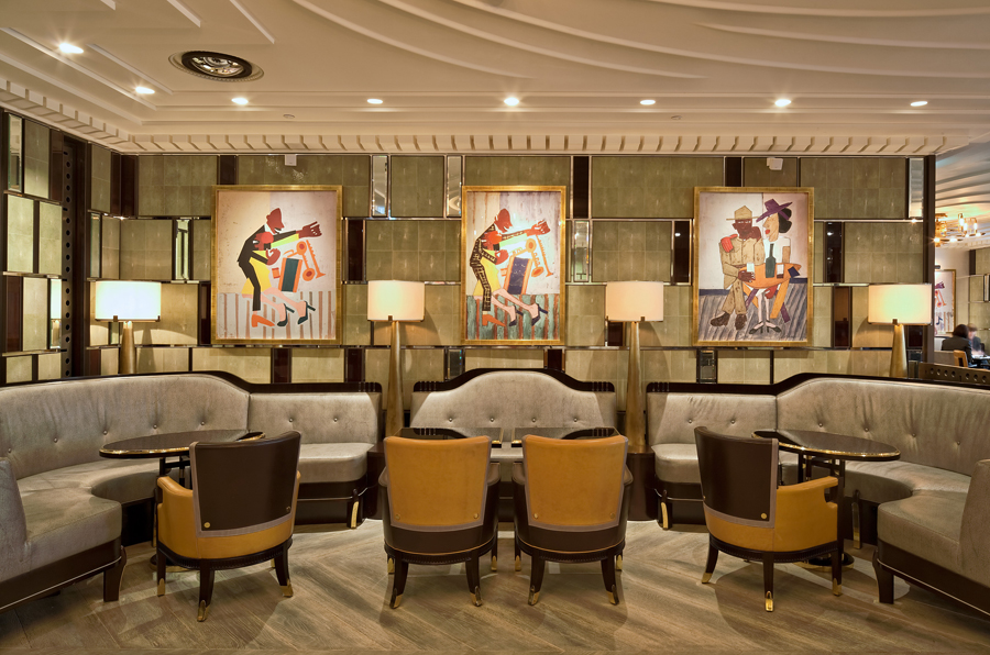
Bassoon Bar at Corinthia Hotel London
These key pieces reference music in a humorous way, details to be gently absorbed as the guests enjoy their champagne or cocktails.
As frequently noted the divide between residential and hospitality interiors is diminishing. Hotel designers are creating spaces with their guests in mind, mimicking a place that feels like home and encourages comfort among guests, but also at the same time provides a sense of exclusivity. Conversely, some of the iconic hotel pieces translate smoothly into the most luxurious interiors. It can be seen that for individuals who travel frequently, staying in the best hotels worldwide, a familiarity with particular pieces of furniture can bring the circle together of “home and away”.
“Residential spaces are incorporating design cues from high-end hotel schemes whilst hospitality interiors are creating more intimate spaces, yet still maintaining a highly luxurious feel.”
-Rita Bancroft, Design Insider
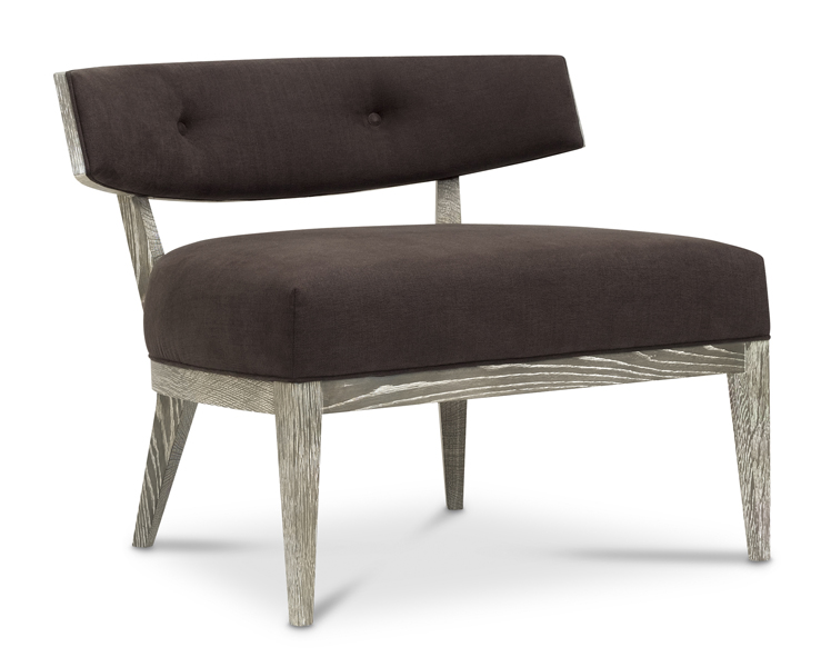
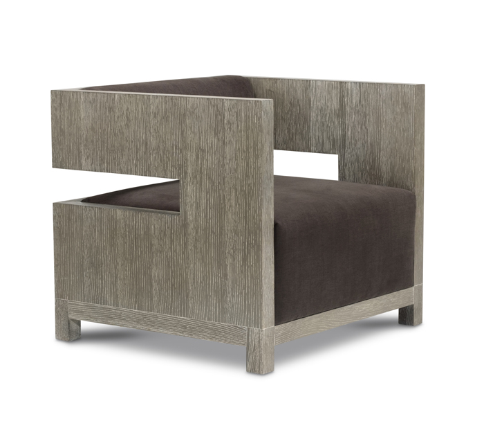
Crescent Lounge Chair & Cube Lounge Chair by Bolier for Decca Home (Domicile Collection)
These pieces from the Bolier collection are both iconic (indeed the cube chair is in the San Francisco Museum of Modern Art) – and we see their use in residential and frequently even hotel interiors.
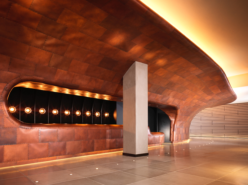
Reception at Mondrian London at Sea Containers
The current focus on warm rich tones has the ability to make even the most cavernous spaces have a more relaxed feel, with cosy corners for more intimate moments. Here at Decca, we have noticed a strong move away from colder metals such as nickel and steel to the warmer, more luxurious tones of bronze, brass and copper.
“We also continue to draw design inspiration from the fields of fashion and jewellery which are currently making effective use of warm metallics with vivid highlight tones.”
-Rita Bancroft, Design Insider
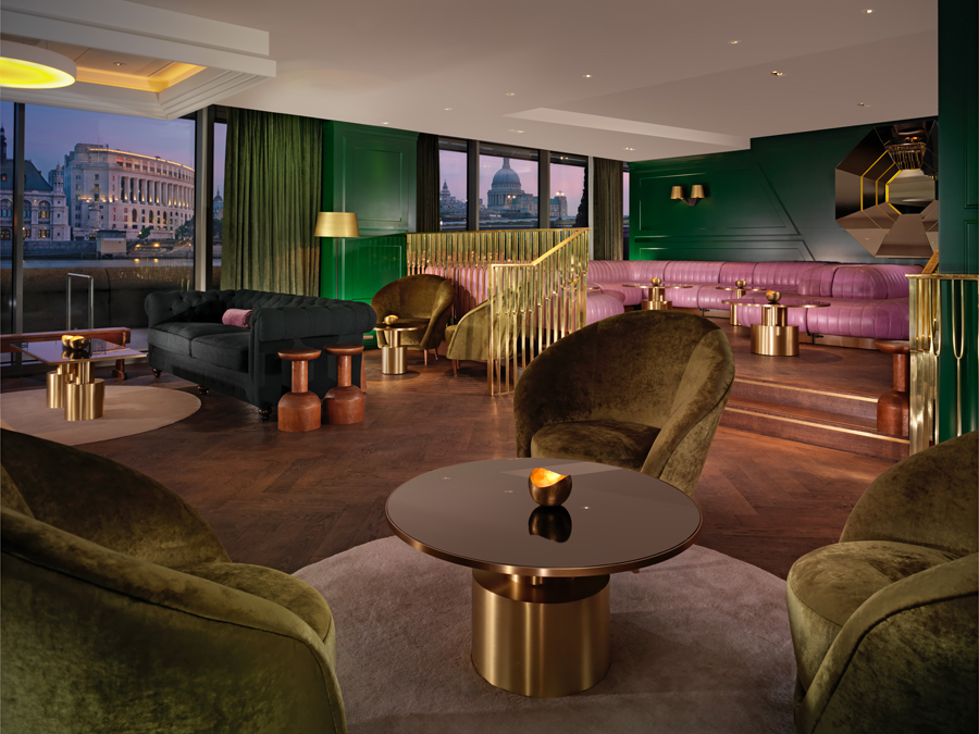
Mondrian Hotel at Sea Containers
Tom Dixon Studio, one of the most renowned design studios in the UK, is widely known for his trademark usage of copper tones. We worked with Tom Dixon Studio to create coffee tables for the Mondrian London at Sea Container. These brass tables were finished in a warm copper tone, so characteristic to Tom Dixon Studio’s design aesthetic.
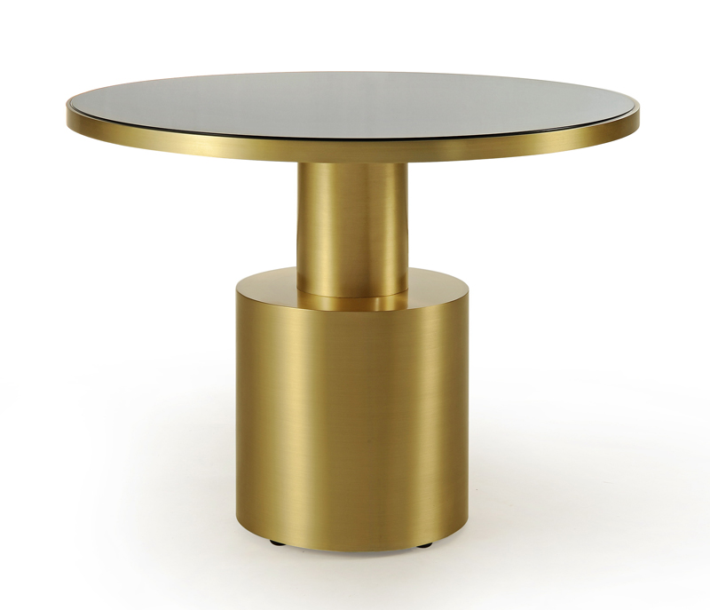
Mondrian Hotel at Sea Containers // Detail of the coffee table
At Decca, we believe that the public area of any hotel is one of the most important parts to any design. Not only does it set the tone for the rest of the hotel, but also it is a personal reflection of the hotel’s history and unique character. Our ability to make one off bespoke pieces works well within these requirements of the works most luxurious hotels, whether supplying single items or adapting designs to suite a wider variety of needs.
Cover photo: The Park Tower Knightsbridge, a Luxury Collection Hotel
Quoted Article (Source at Bottom) : http://www.designinsiderlive.com/be-our-guest/